
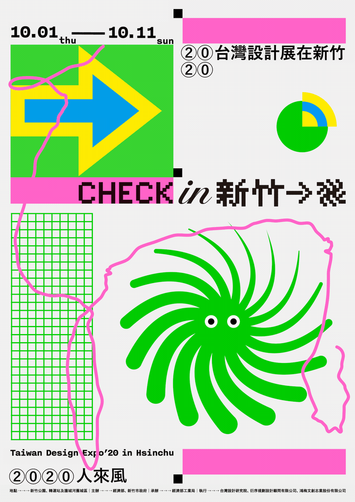
When visitors come to Hsinchu for the first time, what sensations do we want them to feel? Just like this year’s theme—Check in Hsinchu, how do we create impressive and vivid experiential journey through the sense of technology of Hsinchu and its people, and sense of motion of “Check in” and the wind of Hsinchu?
The main visual design aims to incorporate the above concepts, and to be flexibly applied to other derived materials. The four elements, “wind,” “WIFI,” “bamboo,” and “the Internet,” are symbolized and unitized, and flexibly combined to form various visual extensions.
For “wind,” the imagery of “spinning wind” is used to strengthen the symbolism; combined with a sense of motion, wind transforms into Hsinchu Monsters to guide people on their paths of pursuit and exploration, and swirls people to come to “Check in Hsinchu” in October.
“Bamboo,” in hieroglyphics, looks like an “arrow” pointing forward; combined with a sense of motion, the symbol of bamboo is further applied to the signages at various facilities.
The construct of logotype is inspired by the “welcome LED display board” commonly seen in Taiwan; presented through the pixel font and sense of motion of the LED display board, the logotype creates all kinds of application possibilities.